Click for Takeaways: AI Finance Workflows
- Wide adoption, shallow roots: AI adoption in finance has nearly doubled since 2023, but most usage is still shallow with only 17% of finance teams running AI in core workflows.
- The bottleneck was never the analysis: Nearly half of FP&A time is consumed by data collection and validation rather than analysis, which is exactly where structured AI workflows create the most headroom.
- A week’s work, one session: A leading board deck workflow uses a Chat-first planning approach before moving to file-based execution in Cowork, compressing a week-long deliverable into a single session.
- Confidence scoring changes month-end commentary: Variance investigation produces a one-page output with confidence scoring by account and department, ready to use as the basis for month-end commentary.
- Stop diagnosing the last forecast in the next one: Forecast driver assessment lets teams evaluate whether their forecast methods were reliable before the next cycle begins, rather than only discovering gaps in hindsight.
- Prompts that compound: Repeatable prompts saved as projects or skills are what separates one-off AI outputs from workflows that compound in value over time.
AI adoption in finance has nearly doubled since 2023, from 37% to roughly 58% of finance functions, according to Gartner’s 2025 survey of CFOs and senior finance leaders. The challenge is that most usage stays shallow. The same Gartner data shows only a fraction of that adoption has moved into core workflows, and the FP&A Trends Survey 2025 found that 46% of FP&A time is still spent on data collection and validation rather than on the analysis and insight generation the function is supposed to deliver.
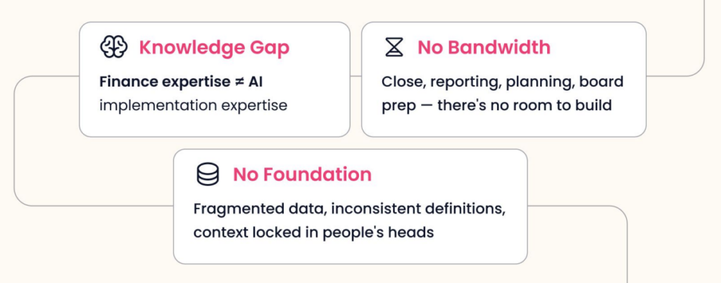
The structural barriers are significant. Finance calendars are organized around close, reporting, planning, and reforecasting cycles, which leaves almost no bandwidth for building new workflows from scratch. Data is often fragmented across systems, inconsistently defined, and partially locked in people’s heads rather than in connected platforms. And most finance professionals haven’t been formally trained in how to prompt a model to produce something trustworthy and repeatable.
The result is a pattern that plays out across thousands of FP&A teams: someone opens a chat tool, gets something impressive, tries it again with different data, gets something off, and walks away convinced AI isn’t ready for their use case. The tool never becomes a workflow. It never enters the actual process.
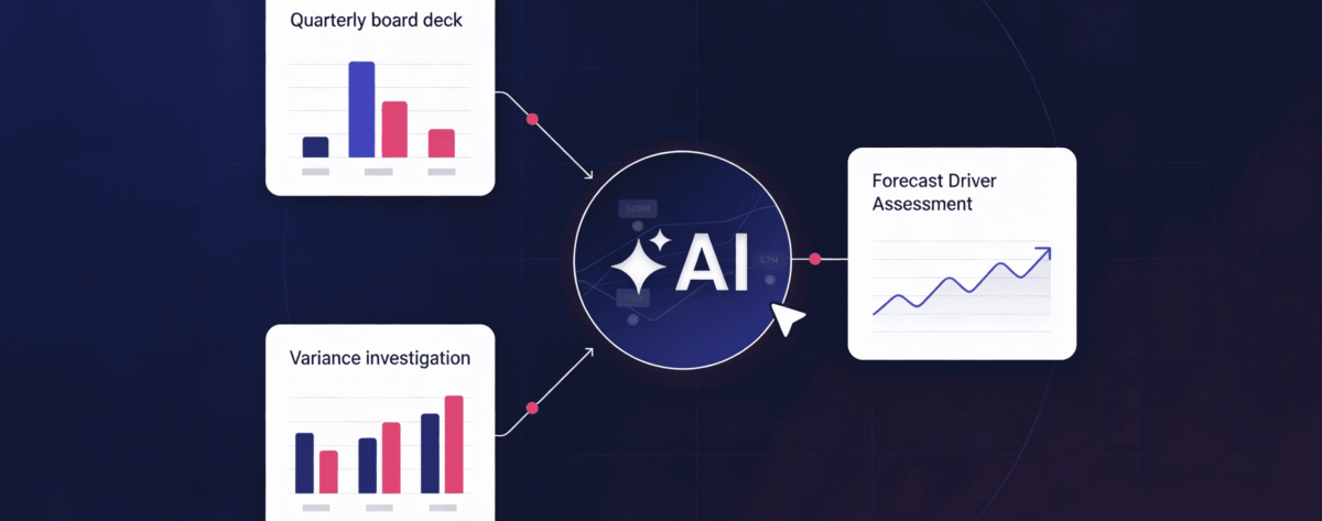
This article covers three workflows that change that pattern: a quarterly board deck, a variance investigation, and a forecast driver assessment, each grounded in what was demonstrated live during a recent Datarails webinar.
Why the Prompt Quality Problem Matters More Than the Model
The quality of what comes out of any AI workflow is entirely dependent on the quality of what goes in, and most teams are prompting at a level that gets them interesting outputs rather than reliable ones.
There are four elements that determine whether a prompt produces something usable.
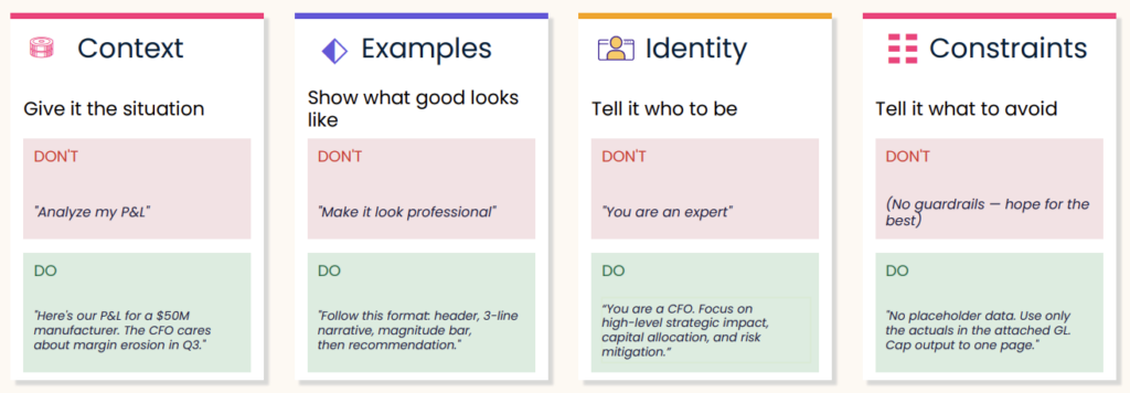
Context means giving the model enough situational information to reason correctly. “Analyze my P&L” gives it almost nothing. “Here’s our P&L for a $50M manufacturer. The CFO cares about margin erosion in Q3” gives it a specific lens, a specific audience, and a specific problem to focus on. The difference in output quality is significant.
Examples mean showing the model what good looks like rather than describing it vaguely. “Make this look professional” is not a useful instruction. “Follow this format: header, three-line narrative, magnitude bar, then recommendation”. Give it structure and it will follow it.
Identity means telling the model whose perspective to reason from. “You are an expert in finance” is too vague. “You are a CFO. Focus on high-level strategic impact, capital allocation, and risk mitigation” gives the model a coherent frame of reference that shapes every decision it makes about what to include and what to cut.
Constraints mean specifying what the output should not include, not just what it should. No placeholder data. Use only the actuals in the attached general ledger. Cap output to one page. These guardrails reduce iteration cycles significantly because the model isn’t filling gaps with assumptions that have to be undone.
Alignment is the goal. Every one of these four elements is a technique for getting the model into the same frame of reference as the person asking the question. When that alignment is high, the first output is close. When it’s low, five iterations still don’t get you there.
The Build Loop: From One-Off to Repeatable
One-off outputs are not workflows. The difference between finance teams that get sustained value from AI and those that don’t is whether they systematize what works.
The build loop has five stages. Start rough in Chat or Cowork. Get a first draft without overthinking the initial prompt. Then test it against real scenarios to see whether the output holds up with actual data. From there, refine: adjust context, add constraints, swap in better examples. Once the prompt reliably produces what you need, encode it as a project instruction, a skill, or a saved template. Then reuse it. The next time you need the same output, you’re starting at 80% instead of zero.
Most teams stop at step one. The teams getting the most from these tools invest the extra step of saving what works and building from there.
Workflow 1: Quarterly Board Deck
The board deck is the most time-intensive recurring deliverable in most FP&A organizations. It draws on every data source, requires synthesis across multiple dimensions, and has to meet a high editorial bar for an executive audience.
The workflow demonstrated in the webinar started in Chat, not Cowork. Chat is the right surface for the planning phase. Before asking the model to build anything, the session used back-and-forth dialogue to establish what the deck should include, what the audience cares about, and what structure would serve both board members and department heads. The output of that conversation was a clear slide architecture covering executive summary, sales performance, profitability, cash flow, headcount, KPIs, and variance commentary.
Still in Chat, the prompt then shifted perspective: “Thinking like a CFO, suggest three changes to this plan that would yield a more impactful deck.” Three meaningful revisions came back:
- Lead with decisions rather than data.
- Replace the KPI scorecard with a narrative bridge that connects the numbers to the story.
- Establish one source of truth across the deck rather than defining metrics differently on different slides.
Each of those changes would have surfaced in a CFO review anyway. Getting them before that review saves a round of revision.
With the plan confirmed, the final Chat step was asking the model to write a Cowork prompt. Rather than trying to write a detailed prompt for a complex file-based build from scratch, Chat generates that prompt automatically. The output included slide-by-slide structure, design requirements including a specific color palette, and instructions for pulling financial data from the connected Datarails instance via MCP.
In Cowork, the model executed the build over roughly 15 to 20 minutes, producing a complete PowerPoint file with an executive summary, P&L performance slides, waterfall charts, capital allocation views, and KPI pages. Because the output was a native .pptx file rather than a locked visual, every slide could be edited, commented on, or removed. The starting point was a complete deck, not a blank slide.
The prompt, once confirmed, was saved as a project so that each subsequent quarterly cycle starts from the same template.
Workflow 2: Variance Investigation
Variance commentary is one of the highest-volume writing tasks in FP&A and one of the most procedural. Across accounts, departments, and periods, the pattern is the same: identify the gap, explain the driver, note the implication. The AFP’s 2025 FP&A benchmarking survey found that 61% of FP&A practitioners cite lack of data reliability as a primary challenge to their technology workflows, and variance analysis is where unreliable data is most visible in the output.
The variance investigation workflow produces a one-pager that surfaces month-over-month movement by account and department, explains the drivers behind the most significant variances, and flags which findings carry the highest confidence. That confidence indicator is a meaningful addition: it helps the analyst prioritize where to spend time verifying and where to trust the output.
The output format in the webinar was a web page rather than a PDF or Excel file, a small but useful design choice. It renders cleanly, it’s easy to share without needing formatting adjustments, and it keeps the focus on the narrative rather than the spreadsheet. The underlying logic can be saved as a skill and reapplied each month with new data.
Workflow 3: Forecast Driver Assessment
The third workflow addresses a gap most finance teams don’t close until it’s too late. By the time a significant variance shows up in actuals, the forecast that missed it is already weeks or months old. A forecast driver assessment looks at that question proactively: were the methods used to build the forecast actually reliable, and if not, what should change for the next version?
The FP&A Trends Survey 2025 found that only 18% of organizations can run scenarios in under one day. A large part of that lag is methodological. Teams default to the same forecasting drivers from the prior period without evaluating whether those drivers actually held. The forecast driver assessment creates a documented basis for changing or keeping specific approaches.
The workflow pulls forecast data and actuals together, evaluates the accuracy of the assumptions used, and produces both a structured Excel output and a Word document summarizing findings. Were the revenue growth drivers modeled in the 5+7 actually predictive? Where did the forecast diverge most from actuals? Was it the driver that was wrong, or the assumption tied to it?
Running this assessment before the next cycle begins rather than after the variance has appeared means the team has evidence to inform the next round of driver selection rather than intuition or habit.
A Note on Data Volume and Context
One question that consistently comes up when finance teams start using LLMs is what happens when the data set is large. Context matters. Bringing in ten companies at the transaction level with 100,000 rows each is a fundamentally different request than bringing in the same ten companies at the account grouping level. The more granular the data, the longer the model takes and the more usage it consumes. Structuring input to match the level of detail the output actually requires is part of good workflow design.
When data flows in from Datarails via MCP, the connection handles data loading automatically, and the permissioning structure from Datarails carries through. Once data is inside the LLM, it’s governed by the security model of whichever AI platform you’re using.
From One-Off to Operating System
The board deck, the variance investigation, and the forecast driver assessment are three distinct outputs, but they share the same underlying logic. Identify what you need, give the model enough context to reason correctly, test the output, refine the prompt, and save it. The first time takes effort. The second time, the job is four-fifths done.
The finance teams getting the most from AI right now are not the ones using the most sophisticated models. They’re the ones who figured out how to make a single workflow repeatable and built from there.
Dig deeper into how FinanceOS by Datarails connects your trusted, consolidated data directly to any AI.
And watch the full webinar right here.
Finance AI Workflows: FAQs
Do I need to have my data already organized in a specific way before trying any of these workflows?
Not necessarily. The workflows shown here used data flowing directly from Datarails, which handles structure and permissioning automatically. If you’re connecting your own files manually, the cleaner and more consistently defined the data is, the faster you’ll get to a reliable output. Starting at the account grouping level rather than the transaction level is usually the right first move.
The live demonstration took roughly 45 minutes end-to-end for a first pass, from the initial planning conversation in Chat through the finished PowerPoint in Cowork. The Cowork execution phase alone took 15 to 20 minutes. The first time through a workflow always takes longer because you’re refining the prompt. Once the prompt is saved and tested, subsequent cycles start from a confirmed template.
Yes. Skills in Claude can be saved as files and shared directly, meaning another person on the team can install the same skill without rebuilding the prompt from scratch. Projects can be shared within a workspace. The intent is that once one person builds a workflow that works, the rest of the team doesn’t start from zero.
That’s exactly what the confidence indicator in the variance investigation output is designed to flag. Higher-confidence findings are worth acting on directly. Lower-confidence findings are worth verifying against the underlying data before using in commentary. The output is a starting point for analyst review, not a replacement for it.
Yes. The Datarails MCP connector routes your financial data into whichever LLM you choose, but you need your own license for that LLM. Claude, Copilot, and ChatGPT are all supported. The choice of subscription tier should reflect how many people will use it, how complex the tasks are, and what your organization’s appetite for AI output in board-level materials is.
Sonnet is the right default for most of these tasks. It balances speed and output quality well for drafting, formatting, and moderate analysis. For more complex financial logic, multi-step scenario builds, or anything going directly to a board audience where accuracy matters most, Opus is the stronger choice. Haiku is useful for high-volume, lower-complexity tasks like data cleanup or classification.