Click for Takeaways: FP&A Dashboard Trends & Insights
- Visibility as a Priority: 68% of CFOs identify real-time visibility as their #1 performance driver, yet the reliance on manual tools remains a major bottleneck for finance teams.
- Decision-Centric Evolution: The industry is moving beyond static charts toward AI-driven dashboards that suggest next steps and integrate recommendations directly into the finance workflow.
- Democratizing Data: Automated insights and natural language queries are making complex financial analysis accessible to non-technical stakeholders, reducing the “reporting burden” on analysts.
- Real-Time Variance: Modern cloud software allows for instant variance tracking, enabling CFOs to spot recurring trends and reallocate resources dynamically rather than waiting for month-end.
- Revenue Impact: Leveraging advanced dashboard analytics can lead to a 14% revenue lift, as live visual data builds stakeholder confidence and allows for faster risk mitigation.
Financial dashboards help finance professionals track and analyze the financial performance of their organization and ease tasks related to financial reporting. By creating a financial dashboard, finance professionals can visualize their numbers in a meaningful way to understand the numbers.
Many professionals are used to using BI tools to visualize their data. Modern dashboards leverage finance analytics platforms to synthesize disparate financial and accounting data. This allows analysts to improve profitability and reduce costs.
A 2024 Deloitte survey found that 68% of CFOs cite real-time financial visibility as their top priority for driving business performance, yet many still rely on manual or outdated tools. This disconnect creates significant operational challenges, as finance teams struggle to provide timely insights for strategic decision-making. Financial dashboards address this gap by consolidating data from multiple sources and delivering instant visibility into key metrics like cash flow, revenue trends, and expense patterns. Organizations that implement effective dashboard solutions can reduce reporting time by hours each month while improving data accuracy.
Financial Dashboard Examples
1. Cash Flow dashboard
A cash flow dashboard displays real-time data helping you monitor your business’s cash flow to help you assess and improve its financial health. An effective cash flow dashboard includes the following essential metrics:
- Cash on hand
Cash on hand is usually monitored so that if it falls below target, the company can take some contingency measures. A rule of thumb is to continuously monitor the cash you have on hand, checking it against the target you set when you made your financial projection. You can quickly tell if you have enough cash on hand to meet short-term needs by analyzing your quick ratio and working capital ratio.
- Cash conversion cycle
By tracking this metric, a business can identify the source of its cash flow problems. A lower cash conversion cycle means that you have more cash on hand to generate returns and reduce your line of credit. The cash conversion cycle formula is:
cash conversion = days inventory outstanding + days receivable outstanding-days payable outstanding
- Gross profit
The gross profit (margin) is the money you make directly from selling goods and services, minus the sale cost. This doesn’t include indirect costs such as marketing. The gross profit can be used to determine the value of every sale and help make decisions regarding pricing and promotions.
gross profit margin=gross profit*100
2. CAGR dashboard
CAGR is the growth rate that gets you from the initial value to the ending investment value, assuming that the investment has been compounding over time. A CAGR dashboard can be used to demonstrate the time value of the money function of the underlying finance analytics platform. Financial institutions such as banks and venture capital firms use this dashboard to show AUM( Assets Under Management) balance by investment type and business unit.
3. Profit and Loss dashboard
A P&L dashboard, also known as a financial dashboard, summarizes expenses, revenues, and the costs acquired throughout a fiscal year. It is used to show the critical performance metrics that describe a business’s profitability and financial health. It helps management find ways to raise the bottom line while reducing unnecessary costs.
Click here for our free Profit and Loss Excel template to track company income and expenses all in one place.
Advanced technology such as data analytics tools and cloud-based financial software facilitates the use of variance analysis by providing real-time data and enhanced visualization capabilities, according to Phoenix Strategy Group’s advisory team. CFO dashboards should present variance metrics in real-time, making it easier to spot and address issues quickly with features like alerts and drill-down capabilities. Regular variance analysis, whether monthly or quarterly, helps CFOs spot patterns, uncover recurring trends, and reallocate resources effectively by adjusting budgets based on real-world performance.
4. Financial performance dashboard
A financial performance dashboard is used to provide an overall view of how a business should spend its revenue. The four metrics used in this dashboard are:
- Return on Assets (ROA)
- Working Capital Ratio (WCR)
- Return on Equity (ROE)
- Debt Equity Ratio (DER)
These four metrics are key to monitoring the real-time success of a business because the users can get a clear view of investment opportunities and revenue liabilities.
5. Expense Detail Analysis dashboard
This dashboard lets you record monthly target and actual expenses and make comparisons to see the target realization percentages in Excel. It also allows the user to explore the relationships between all values in their data model, such as expense types, products, etc.
6. Balance sheet dashboard
A balance sheet dashboard allows the users to review and analyze data from their balance sheets and gain a quick understanding of the business’s financial condition and, as they close the books each month, diagnose any abnormalities in the data. A balance sheet dashboard usually contains 9 KPIs, and they are:
- Current assets- the assets expected to be turned into cash in less than a year, which include accounts receivables, cash, and inventory.
- Current liabilities- the bills that must be paid within one year of the balance sheet date, which includes accounts payable, accrued expenses, and income taxes payable.
- Working capital- the amount of money the business has to work within the short term. It includes current assets and current liabilities.
- Working capital ratio- the % of current assets/current liabilities
- Liquidity ratio- the % current liabilities/current assets
- Total assets- these are the final amount of all gross investments, receivables, and other assets presented on the balance sheet.
- Total liabilities- the sum of current liabilities and long term debt
- Total equity- total assets minus total liabilities
- Debt to equity ratio- how much debt the company has relative to investor equity. Total liabilities/total equity %.
Click here for our free balance sheet template to get insights into reported actuals and adjust the scenario selection for each month to evaluate performance against the plan.
7. Profit Margin Analysis/ CFO dashboard
A CFO dashboard is there to enhance the analytical and strategic efforts related to every financial aspect of the business. This dashboard comprehensively consolidates data to help improve the decision-making process by utilizing intuitive analytical tools and dynamic financial key performance indicators. It focuses on four primary areas: gross profits, costs, sales goals, and customer and employee satisfaction.
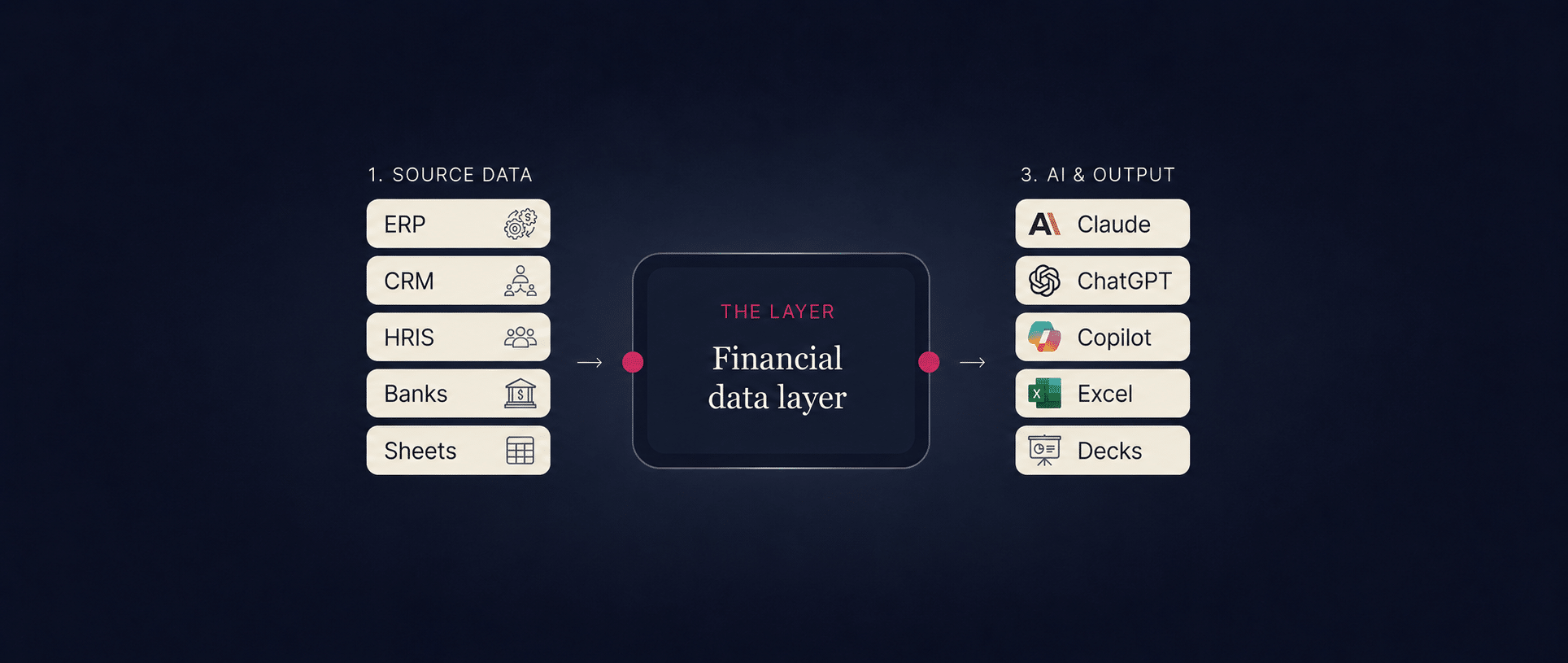
How to add a financial dashboard manually as well as automatically via Datarails
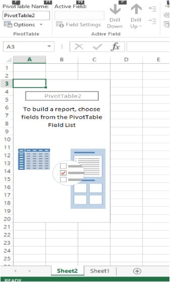
Creating a financial dashboard using excel
- Consolidate all your data on an Excel spreadsheet
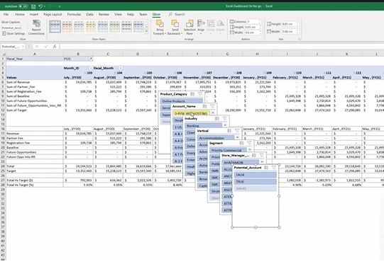
- Create a pivot table, selecting your range and tabs
3. Create a chart- bar chart, line chart, pie chart, or combo chart and rename the series as per their representation.
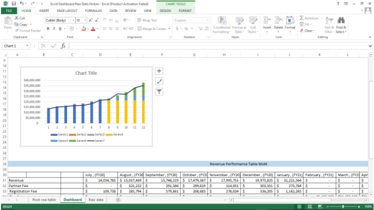
4. Insert slicers. On the pivot, raw data sheet, click on the pivot table analyze, insert slicer. Choose the fields you need.
5. Copy the categories you want and paste them on the slicer section of the dashboard sheet.
6. You can create as many pivot tables and charts as required and sanitize them for the different statements.
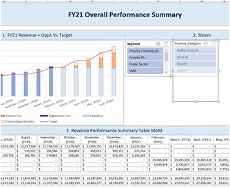
7. After you make the slicers, your complete chart should look like this.
Adding a financial dashboard using Datarails.
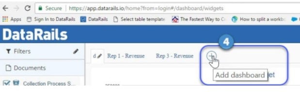
- Hover the mouse over the encircled plus on the Datarails blue panel.
- Click on “add dashboard.”
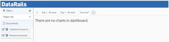
3. Name the dashboard and click on “add dashboard.”
4. The dashboard will appear as a tab, and you can add as many as you like.
5. Once you click on the named dashboard, a canvas will appear with the text, “there are no charts in the dashboard.”
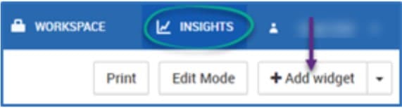
6. Click on the “+ add widget” button. Once you add the widget, build tools for your chart/table will be presented.
7. On the left-hand side, click on “select your template,” A list of tables you have created will appear. After choosing your template, the relevant elements needed for your chart/graph will appear under the template name.
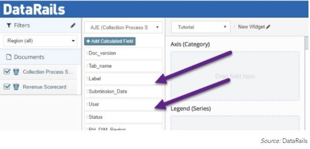
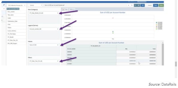
8. Drag the field elements from the template panel to the appropriate graphing section to the right.
9. Build the visual component by hovering the mouse over the field elements until it turns into a white crosshair. Left-click on the field and drag it over to graphing box 1,2,3 or 4.
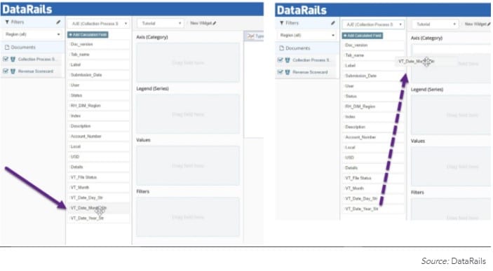
10. Repeat until you have all the you wish included in your graph or table.
Examine the big picture
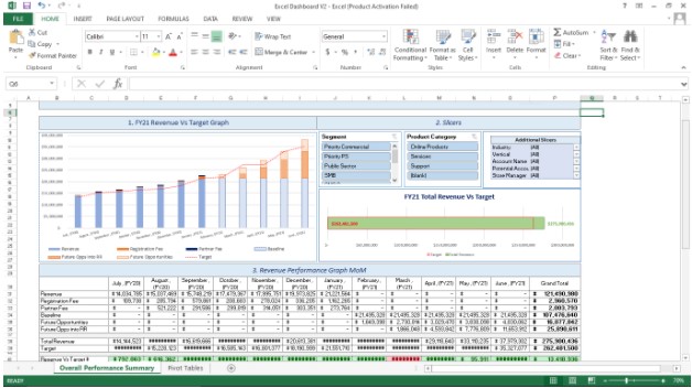
When presenting financial reports or numbers, showcase a comprehensive view of your data with financial dashboards that reflect the historical and projected activity. Easily create dashboards that reflect expected and current numbers, and focus on the financial KPIs that mean the most to you.
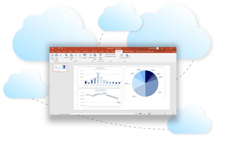
With Datarails, you can create dashboards in Excel and export them to Datarails’ Insights visualization feature and PowerPoint.
Here’s one financial dashboard example:
The Datarails dashboard environment uses an assortment of graph types, from the most commonly used column, pie, and line charts to spider charts and gauges. Each graph highlights specific aspects and assists in driving meaningful insights from the collected data.
The main capabilities of the financial dashboard include:
- Visualize and analyze the data extracted from the files
- Roll pp
- Drill-down
- Slice & dice
- Share by permission
Key capabilities of a financial dashboard
Powerful financial dashboards are able to bring together multiple sources of data to provide a complete and accurate financial picture. Financial professionals can then explore this unified set of data whichever way they please, straight within the dashboard. Observe key operational metrics, delve into interactive charts and tables, and explore your numbers.
According to Gartner’s 2024 Data Analytics Summit, the industry is moving from delivering static dashboards to enabling real-time, contextual insights. The focus has shifted from insights to decisions, with analytics platforms embedding recommendations, scenario planning, and prescriptive analytics into workflows. Modern financial dashboards now incorporate AI agents that don’t just highlight trends but suggest next steps, helping organizations transition to decision-centric analytics. This means finance professionals can leverage tools that automatically flag anomalies and provide predictive forecasts.
Real-time, accurate data
With Datarails, you can easily examine consolidated numbers from disparate sources thanks to automated consolidation of all organizational data, irrespective of data structure. And when you present the business landscape to decision-makers, the solution’s single-click drill-downs will allow you to confidently back up answers on the fly to their questions, should they arise.
Gartner identifies automated insights as a critical capability in analytics platforms, defining it as the ability to apply machine learning to automatically generate insights for end users. Natural language query (NLQ) features enable users to ask questions of data using typed or spoken terms, making financial analysis accessible to non-technical stakeholders. These capabilities transform how finance teams interact with data, reducing time spent on manual analysis and enabling a focus on strategic interpretation rather than data preparation.
Objectivity and accuracy are vital. CEOs need to know where things stand, for better or for worse, and as soon as possible. Datarails has a live embedded charts feature that is perfect for this. When you present your report, your figures and charts update on the spot thanks to real-time, live charts.
Build a dashboard that delivers insight
Give decision-makers a quick refresher of how things were and how they are now before telling them where things seem to be going. Drill down into the numbers to explain root causes. Comprehensive coverage of the past and present will give them the perspective they need to look into the future.
Visuals can help with this and straightforwardly convey your message. Datarails’ Insights feature is excellent for this. The web-based, real-time dashboards are fully customizable, allowing you to visualize your financial data as you see fit. Look into whatever factors you’d like to examine, including trend analysis graphs, financial statements, and actual vs. budget comparisons.
Forrester reports that companies focusing on customer experience using CLV insights see a 14% revenue lift compared to those that don’t leverage these analytics. Effective financial dashboards provide enhanced visibility across teams, ensuring that marketing, operations, and sales have clear sight of the metrics that drive the business forward. Board meetings become smoother when executives can pull up live visual dashboards, providing credibility and confidence. Dashboards help finance leaders catch red flags early, enabling proactive risk management and more effective strategic planning.
Datarails is the best FP&A software that can help you ensure that decision makers see exactly what they need to see in order to make the best decisions for the organization. With Datarails, deliver to decision makers what they need, exactly when they need it.
Financial Dashboard FAQs
FP&A dashboards are essential because they provide immediate visibility into company performance. They help finance teams identify trends early, reduce the time spent on manual reporting, and enable faster, data-driven decisions that align with long-term strategic goals.
Most effective FP&A dashboards include a mix of P&L metrics (revenue, expenses, margins), cash flow data, and performance indicators such as budget vs. actual variances, burn rates, and customer acquisition costs.
By centralizing data from multiple sources in real-time, dashboards allow FP&A teams to update forecasts instantly. They enable “what-if” scenario modeling, helping leaders understand the financial impact of different business decisions before they are made.
While built and managed by FP&A analysts and finance managers, these dashboards are used by CFOs and department heads to monitor health. They also serve as a primary communication tool during board meetings and executive reviews to guide strategic planning.