Click for Quick Takeaways
CFO dashboards fail when executives need them most. When leadership asks unexpected “what if” questions in meetings, the data exists but answers live in Excel, outside the room, forcing finance into follow-up mode instead of real-time decision partnership.
Scenario planning is the #1 CFO priority, but dashboards can’t deliver. More than half of CFOs cite enhanced scenario planning capabilities as their top action for managing uncertainty, yet only 22% of organizations can run financial scenarios within a day, and 21% can’t run them at all.
Data quality undermines even sophisticated dashboards. 61% of FP&A professionals cite unreliable data as their primary technology challenge, while 60% point to lack of data accessibility, making visualizations misleading when built on fragmented, untrustworthy foundations.
Decision-ready dashboards require three core capabilities. They must enable forward-looking decisions through embedded scenario modeling, make cause and effect transparent through driver-based visibility, and balance access with control through governed environments that protect model integrity.
The solution is technical, not cosmetic. Effective dashboards need interactive scenario modeling in the visual layer, real-time data ingestion from core systems, automated variance explanations, and drill-down paths that keep analysis connected to source data, transforming dashboards from reporting surfaces into decision infrastructure.
CFO dashboards can fail at the exact moment they’re supposed to save the day.
They look polished, track the right KPIs, and update on schedule. And then, an executive asks an unexpected question your dashboard can’t answer:
- “What happens if we delay the launch?”
- “If we hire faster, how long does our cash last?”
- “What changes if this deal slips to next quarter?”
The data and financial models exist, but the answers live somewhere else, usually in Excel, on someone’s laptop, outside the meeting.
The problem is clear: traditional financial dashboards are built to report what’s already happened. CFOs are expected to explain what happens next. When dashboards can’t flex, simulate, or explain drivers in real time, finance becomes a follow-up function instead of a decision partner. By the time you circle back, the moment has passed. The decision itself may no longer be relevant.
The next evolution of financial data visualization must go beyond charts, turning dashboards into live decision engines, where assumptions can be adjusted, scenarios tested, and trade-offs understood as decisions are being made.
This article explores what modern CFOs are thinking about financial data visualization, why most dashboards fall short, and what it takes to build dashboards that actually support real-time decision-making.
Why Financial Data Visualization Is a CFO Priority Now
Decision cycles are getting shorter, but most financial dashboards are still built for static reporting. That mismatch is why financial data visualization has become a priority for CFOs.
It all comes down to a few practical realities:
- Volatility compresses decision timelines: Revenue, hiring, and cash assumptions shift mid-period, while many financial performance dashboards still rely on fixed, backward-looking views.
- Leadership expects real-time scenario answers: Executive teams want to test options during meetings, not wait for follow-ups driven by offline models outside the budget vs actual dashboard.
- Dashboards show results, not drivers: Data visualization in finance tends to surface outcomes without explaining what moved them, forcing finance to manually interpret variance.
- Scenario modeling lives outside the visual layer: Alternative forecasts often sit in spreadsheets, disconnected from real-time financial reporting shared with leadership.
- Non-finance leaders need visibility without vulnerability: As dashboards are shared more widely, finance needs financial data visualization that allows exploration without breaking models or controls.
The urgency is backed by recent research. When asked to identify the most important actions for managing uncertainty, more than half of CFOs pointed to enhanced scenario planning capabilities as their top priority, Yet only 22% of organizations can run financial scenarios within a day, while 21% can’t run them at all, per the 2024 FP&A Trends Survey.
This gap between what CFOs need and what their dashboards can deliver is why financial data visualization has moved from reporting concern to strategic imperative.
CFOs need to rethink how financial data is visualized and what capabilities dashboards need when decisions are made in the moment.
Related Content: What is Financial Modeling? A Complete Guide for Finance Professionals
What Does Financial Data Visualization Need to Deliver?
Financial data visualization in finance serves one primary purpose: turning financial models into tools that support real-time decision-making. That’s a fundamentally different goal than retrospective reporting or static analysis.
CFOs evaluating dashboards should focus on whether they deliver against three core objectives:
Enable forward-looking decisions under uncertainty: Finance teams need to test scenarios, adjust assumptions, and understand trade-offs while discussions are happening, not afterward. Dashboards must support “what if” exploration as naturally as they display actuals.
Make cause and effect transparent: Seeing that revenue missed or costs rose isn’t useful without understanding why. Dashboards need to connect outcomes to the drivers behind them so finance can guide corrective action rather than just report results.
Maintain trust while enabling broad access: As financial visibility extends beyond the finance team, dashboards must let non-finance stakeholders explore data safely. Control and governance can’t come at the expense of accessibility, and accessibility can’t compromise model integrity.
These goals separate dashboards built for reporting from dashboards built for decision support. Finance teams operating under real constraints, volatile conditions, and compressed timelines need visualization that keeps pace with how decisions actually get made.
Why Traditional Financial Dashboards Fail
CFOs need dashboards that hold up when decisions are being made in real time, or when conditions change on the fly.
Here are a few of the biggest reasons why traditional dashboards are failing today:
Fragmented data creates blind spots
Financial data often lives across ERP, CRM, payroll, billing, and planning tools. When these systems aren’t fully aligned, financial data visualization reflects only partial truth. Dashboards look complete, but key dependencies, like pipeline timing or payroll lag, are missing, leading to decisions based on incomplete context.
The data integrity problem is quantifiable. AFP’s 2025 FP&A Benchmarking Survey found that 61% of FP&A professionals cite lack of reliable data as their primary technology challenge, while 60% point to lack of data accessibility. When the data feeding dashboards can’t be trusted, even the most sophisticated visualization becomes misleading.
Static charts hide emerging risk
Many financial performance dashboards are built on monthly snapshots. They show what already happened, not what’s unfolding. Early signals, like delayed receivables or slowing bookings, get buried until they hit actuals, by which point response options are limited.
KPIs without drivers slow action
Seeing that revenue is down or costs are up isn’t enough. Without driver-level visibility, data visualization in finance forces finance teams to explain variance manually. This slows decisions and increases reliance on hunches instead of evidence.
Scenario modeling sits outside the dashboard
In most teams, “what if” analysis happens in spreadsheets separate from the forecast vs actual dashboard executives see. This disconnect makes it hard to evaluate alternatives live and pushes critical decisions into follow-up cycles.
Dashboards answer planned questions, not real ones
Dashboards are usually designed around anticipated questions. But leadership rarely sticks to the script. When an unplanned question comes up, most financial analytics dashboards can’t adapt quickly enough, leaving CFOs and FP&A directors scrambling to recreate analysis offline.
Non-finance users can’t interact safely with the data
As dashboards are shared more widely, finance must balance access with control. Many financial data visualization tools either lock users out entirely or expose models to risk. Without a safe sandbox, finance becomes a gatekeeper instead of a partner.
Version confusion undermines trust
Multiple exports, slides, and spreadsheet versions quickly drift out of sync. When leaders question which view is correct, confidence in real-time financial reporting erodes, even if the underlying data is sound.
These limitations explain why many dashboards look impressive but underperform when decisions are on the line.
Visualization breaks at organizational boundaries
Finance decisions rarely live in isolation. Pricing, headcount, and investment choices span multiple teams. Yet most data visualization in finance stops at financial outputs and doesn’t connect operational inputs, like sales capacity or delivery constraints. When those links are missing, dashboards reflect finance in isolation instead of the business as a system.
Dashboards reinforce hindsight bias
Traditional financial analytics dashboards are built to explain what has already happened. Over time, this trains leaders to evaluate decisions after the fact rather than test them beforehand.
Building Dashboards That Actually Deliver
Once the limitations of traditional dashboards are clear, the question becomes practical: what capabilities and infrastructure do finance teams need to meet those three core objectives?
The answer lies in specific technical components and design principles that transform dashboards from passive reporting surfaces into active decision infrastructure.
Making forward-looking decisions practical
Interactive scenario modeling: The ability to adjust assumptions and layer alternatives directly onto dashboards turns them into tools where trade-offs can be explored without rebuilding models offline. Rather than switching between files or views, effective dashboards allow finance to layer multiple scenarios onto the same base view, preserving context while enabling rapid comparison.
Time-aware comparison architecture: Finance doesn’t operate in single snapshots. Dashboards need to compare actuals against forecasts, prior periods, and alternative scenarios simultaneously. This temporal awareness prevents misinterpretation and keeps short-term decisions aligned with longer-term plans.
Real-time data ingestion: When dashboards rely on delayed or manually refreshed data, they introduce uncertainty at critical moments. Continuous ingestion from core systems ensures what finance sees reflects current reality, not last week’s close.
Connecting outcomes to underlying drivers
Driver-based visibility throughout: Effective dashboards pair every result with the inputs that moved it. Understanding whether a revenue miss came from volume, pricing, timing, or mix is what enables action. This means surfacing drivers directly in the visualization layer instead of forcing finance teams to explain movement verbally.
Drill-down paths for rapid investigation: When something looks off, finance needs to understand why without leaving the conversation. The ability to move from summary views into transaction-level detail keeps analysis connected to source data rather than forcing separate investigation cycles.
Automated variance explanation: Embedded analysis, contextual annotations, and smart alerts explain why metrics changed without requiring manual interpretation. This reduces the time finance spends translating numbers and increases the time available for guiding decisions.
Balancing access with control
Governed exploration environments: Teams need spaces where non-finance leaders can test assumptions and explore alternatives without overwriting formulas, breaking logic, or creating version chaos. Strong platforms separate the model layer from the interaction layer.
Version control and audit trails: Unlike exploratory analytics, finance visualization must maintain a clear lineage of assumptions, changes, and decisions. This ensures trust even as dashboards are shared more widely across the organization.
Role-based interaction boundaries: Different stakeholders need different levels of access. Effective platforms let finance define who can view, explore, or modify scenarios without building separate dashboard instances for each audience.
When these capabilities work together, dashboards become infrastructure for decision-making rather than artifacts of analysis. They reduce explanation cycles, surface risk earlier, and keep strategic conversations grounded in financial reality.
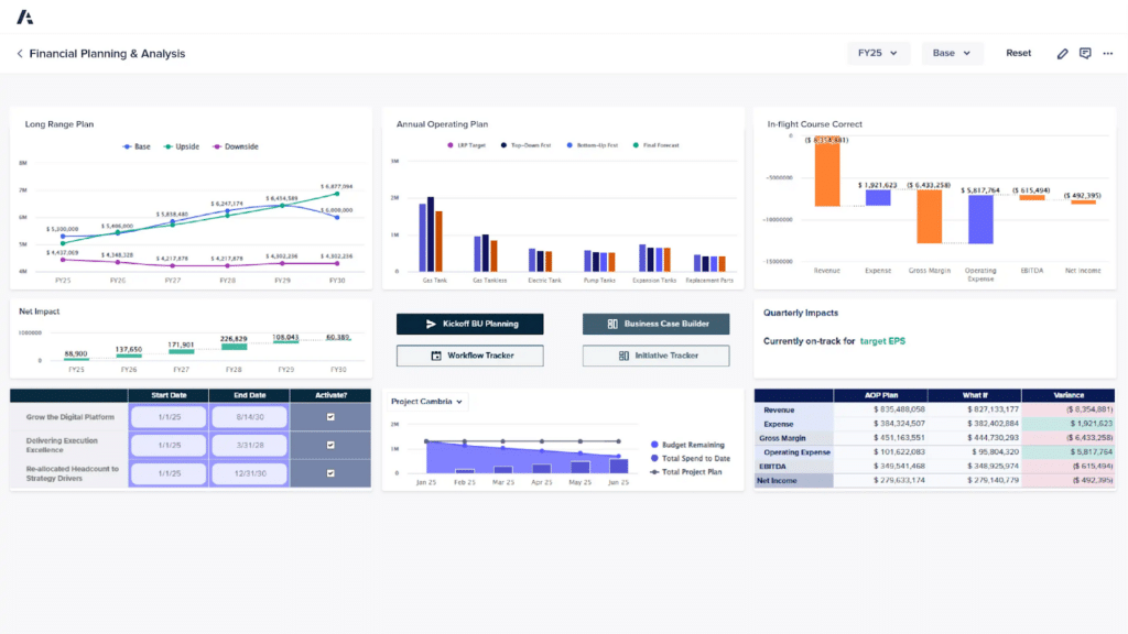
Types of Financial Dashboards CFOs Actually Need
Not every dashboard serves the same purpose. CFOs rely on different dashboards at different moments, depending on the decision in front of them. The most effective financial dashboards are designed around specific financial questions rather than generic reporting views.
Financial performance dashboards for executive visibility
These dashboards provide a high-level view of revenue, margins, EBITDA, and key trends. What makes them effective is not the metrics themselves, but the ability to trace performance back to underlying drivers. Strong financial performance dashboards combine summary views with drill-down paths so leadership can understand what’s moving results without leaving the conversation.
Budget vs. actual dashboards for accountability and control
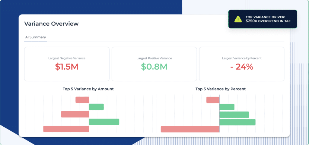
This dashboard category exists to explain deviation over simply measuring it. Effective budget vs actual dashboards surface variance by driver, such as volume, timing, or cost category, and make it clear whether gaps are temporary or structural. When built correctly, they reduce defensive discussions and focus attention on corrective actions.
Related Content: What is a budget forecast?
Forecast vs. actual dashboards for planning accuracy
Forecast usefulness matters just as much as accuracy. Forecast vs actual dashboards help finance understand where assumptions consistently break down and why. Time-aware comparisons and scenario overlays allow teams to refine future forecasts based on real performance patterns, strengthening rolling planning processes.
Cash flow dashboards for liquidity and risk management
Cash decisions are time-sensitive and unforgiving. Cash flow forecasts and dashboards track inflows, outflows, and runway while highlighting timing risk, such as delayed receivables or accelerated spend. Effective visualization of financial data in this context helps CFOs anticipate pressure points before liquidity becomes a constraint.
FP&A dashboards for scenario-driven planning
FP&A dashboards support forward-looking decisions across hiring, investment, and growth planning. These dashboards rely heavily on driver-based metrics and scenario overlays, allowing finance to test assumptions and understand trade-offs in real time. This is where financial data visualization most directly supports strategic decision-making.
Each of these dashboards plays a distinct role, but they work best as a connected system. When performance, variance, forecasting, and cash views share consistent data and logic, finance gains a coherent picture instead of fragmented insights.
Framework: How to Visualize Financial Data for Better Decisions
Effective financial data visualization doesn’t start with charts or tools, but rather with clarity on what decisions finance needs to support.
This conceptual framework reflects how CFOs and FP&A teams can design dashboards that remain useful as conditions change.
1. Start with decisions, not metrics
Before defining KPIs, define the decisions the dashboard must support. Hiring pace, investment timing, pricing changes, or cost controls each require different views of the data. When financial dashboards are built around decisions, metrics become inputs, not the focus.
2. Design around drivers, not summaries
High-level numbers explain outcomes, but drivers explain movement. Strong data visualization in finance makes revenue, cost, and cash drivers explicit so users can see how changes flow through the model. This shifts dashboards from passive reporting to active exploration.
3. Use rolling time horizons
Finance operates across overlapping timelines. Dashboards should reflect that reality by supporting weekly, monthly, and quarterly views simultaneously. Time-aware financial performance dashboards prevent misinterpretation and keep short-term decisions aligned with longer-term plans.
4. Add context automatically
Dashboards shouldn’t require verbal explanation to be understood. Automated variance explanations, annotations, and alerts provide essential context directly within financial analytics dashboards, reducing reliance on manual interpretation and improving consistency.
5. Embed scenario modeling into the visual layer
Scenario analysis mustn’t depend on separate files. When scenarios are embedded directly into financial data visualization, CFOs can test assumptions and evaluate trade-offs without breaking flow. This is what turns dashboards into decision tools instead of static references.
6. Protect governance while enabling exploration
Finance needs to maintain control over logic, assumptions, and data integrity. Effective financial data visualization tools balance flexibility with governance, allowing stakeholders to interact with scenarios without overwriting models or creating version chaos.
Related Content: A Day in the Life of an FP&A Analyst
Examples of Financial Data Visualization in Action
Frameworks matter only if they hold up in real situations. These examples show how financial data visualization supports decisions when conditions change and time is limited.
Example 1: A small budget variance hides a larger structural risk
On the surface, the budget vs. actual dashboard shows revenue tracking only slightly below plan. In a traditional view, this looks manageable. But when finance applies driver-based design from the framework, the issue becomes clearer.
By breaking revenue into volume, pricing, and timing drivers, the dashboard reveals that most of the variance is tied to delayed deal closures rather than demand. A scenario overlay shows that if those deals slip another month, the impact on cash and forecast accuracy compounds quickly.
Here, visualizing financial data around drivers and time horizons turns a minor variance into an early warning, allowing finance to act before the risk becomes material.
Example 2: Cash runway looks stable until assumptions change
A cash flow dashboard shows sufficient runway based on current assumptions. But leadership asks what happens if receivables slow or hiring accelerates. Without embedded scenario modeling, this question would normally trigger offline analysis.
Using scenario overlays directly in the dashboard, finance adjusts collection timing and headcount assumptions. The visualization immediately reflects the impact on runway, exposing a potential liquidity constraint weeks earlier than a static view would allow.
This is the framework in action, where decisions are first, drivers are visible, and scenarios are embedded. Financial data visualization becomes a way to test risk, not just monitor balance.
Example 3: Forecast accuracy improves through rolling visual comparisons
Finance notices recurring gaps between forecast and actuals but struggles to explain why. A forecast vs actual dashboard built with rolling time horizons shows that assumptions consistently break down in the final weeks of each quarter.
By comparing actuals, prior forecasts, and revised scenarios side by side, finance identifies where timing and volume assumptions are systematically optimistic. That insight feeds back into planning, improving future forecasts without adding complexity.
In this case, financial dashboard software doesn’t just measure accuracy. They help finance learn from patterns and refine decision logic over time.
How AI Transforms Financial Data Visualization
AI isn’t a replacement for financial judgment, but when implemented correctly, it removes friction around analysis, explanation, and scenario testing to further strengthen financial data visualization.
Here are a few ways AI finance tools can make an impact:
- Automated variance explanations: AI adds context directly into financial analytics dashboards, explaining why numbers moved without requiring manual walkthroughs.
- Predictive insights inside dashboards: Instead of reacting to changes after the fact, AI highlights emerging risk and opportunity within financial performance dashboards.
- Scenario generation at speed: AI accelerates “what if” analysis by helping create and compare scenarios directly in financial data visualization, without rebuilding models from scratch.
- Exception detection: AI surfaces anomalies and outliers that matter, helping finance focus attention where it has the most impact.
- Narrative insights for executives: AI-generated summaries translate complex movements into clear explanations, improving how data visualization in finance supports executive conversations.
How Financial Data Visualization Fits Into FP&A Workflows
The value of financial data visualization shows up in how well it supports recurring FP&A workflows. When dashboards align with these moments, finance spends less time preparing views and more time driving decisions.
| FP&A workflow | How financial data visualization is used | Why it matters |
| Weekly executive reviews | Financial performance dashboards surface current trends with driver-level context | Keeps leadership aligned without forcing finance to translate numbers every week |
| Month-end close and reporting | Real-time financial reporting updates dashboards as data is finalized | Reduces rework and prevents version confusion during high-pressure close cycles |
| Rolling forecasts | Forecast vs actual dashboards compare assumptions against outcomes over time | Improves forecast quality by showing where assumptions consistently break down |
| Budget planning | Budget vs actual dashboards highlight variance drivers and trade-offs | Shifts discussions from justification to corrective action |
| Scenario planning | Financial analytics dashboards support live “what if” testing | Allows finance to evaluate options during discussions instead of after them |
| Treasury and cash planning | Cash flow dashboards track runway, timing risk, and liquidity scenarios | Helps CFOs anticipate pressure points before cash becomes a constraint |
Top Financial Data Visualization Tools
The hardest part is choosing the right solution to operationalize all of these capabilities and transform your approach to financial data visualization.
Use this quick list to learn more about the top solutions available.
1. Datarails
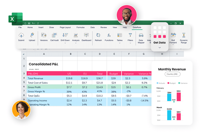
Datarails is an AI-forward, Excel-native FP&A platform designed to turn financial dashboards into interactive decision tools through real-time consolidation, scenario modeling, and AI-assisted insights.
Pros:
- Financial data visualization embedded directly in Excel workflows
- Live scenario modeling inside dashboards, not offline
- Strong consolidation layer creates a true single source of truth
Cons:
- Best fit for teams that rely heavily on Excel
- Some advanced logic uses proprietary syntax
- Less appealing for teams trying to move away from spreadsheets entirely
2. Cube
Cube is a modern FP&A platform that connects Excel and Google Sheets to a centralized data model, prioritizing speed, usability, and lightweight planning.
Pros:
- Native support for both Excel and Google Sheets
- Fast implementation compared to enterprise tools
- Clean, intuitive interface for finance teams
Cons:
- Scenario modeling is less embedded in the visual layer
- Can become complex as entity count grows
- Struggles to support custom and more advanced workflows
3. Vena Solutions
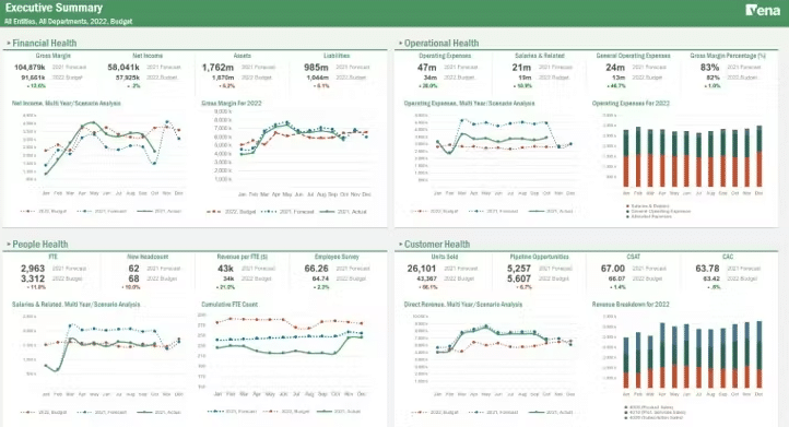
Vena Solutions is another Excel-based enterprise FP&A platform focused on structured planning, workflow control, and auditability across larger organizations.
Pros:
- Strong governance, workflows, and audit trails
- Excel familiarity reduces adoption friction
- Good support for complex, multi-department planning
Cons:
- Longer implementation timelines
- Often requires external consultants
- Can feel heavy for mid-market teams needing agility
4. HiBob
HiBob, the HRIS platform, now offers headcount planning and FP&A, following its acquisition of Mosaic It’s aimed at fast-growing companies, combining real-time reporting, forecasting, and collaborative analysis.
Pros:
- Integrates workforce and financial planning in one platform
- Modern UI with quick integrations to cloud tools
- Real-time visibility linking HR decisions to financial impact
Cons:
- Still integrating post-acquisition, features evolving
- Less proven than standalone FP&A platforms
- Best suited for companies wanting combined HR/finance solution
5. Planful
Planful is a cloud-based financial performance management platform built for structured budgeting, consolidation, and enterprise reporting.
Pros:
- Strong consolidation and forecasting capabilities
- Robust support for complex financial structures
- Mature platform with broad functionality
Cons:
- Steep learning curve
- Implementation can be resource-intensive
- Less flexible for ad-hoc scenario exploration
6. Workday
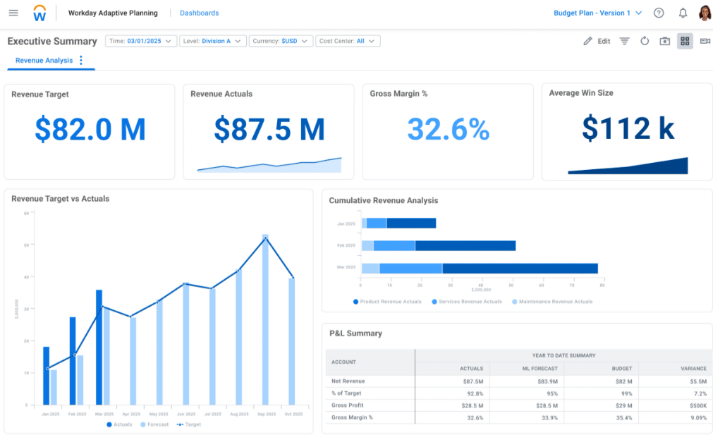
Workday is another enterprise planning solution designed for large organizations with complex, multi-dimensional modeling needs.
Pros:
- Highly scalable for large datasets and teams
- Deep integration with the Workday ecosystem
- Strong collaborative planning features
Cons:
- High total cost of ownership
- Customization after setup can be difficult
- Often requires dedicated administrators or consultants
7. Prophix

Prophix is a financial performance platform covering planning, reporting, consolidation, and account reconciliation in one system.
Pros:
- Broad automation across finance workflows
- Built-in BI reduces reliance on third-party tools
- Easier structural changes compared to some enterprise platforms
Cons:
- Feature breadth increases onboarding time
- Custom pricing can be costly for smaller teams
- UI can feel dense for casual users
8. Anaplan
Anaplan is a highly flexible, enterprise-grade planning platform designed for complex, cross-functional modeling at scale.
Pros:
- Extremely powerful and flexible modeling engine
- Real-time calculations across large datasets
- Strong for finance-to-operations planning
Cons:
- Very steep learning curve
- Long deployment cycles
- Requires specialized model-building expertise
9. Fathom

Fathom is a lightweight financial reporting and analysis tool focused on management reporting and benchmarking for SMBs.
Pros:
- Simple, visual management reporting
- Easy to use with minimal setup
- Strong multi-entity benchmarking features
Cons:
- Limited scenario modeling capabilities
- Not a full FP&A or consolidation platform
- Less suitable for complex forecasting needs
Turn Dashboards Into Decision Engines with Datarails
Traditional dashboards were built to report results, but CFOs now need dashboards that help shape outcomes. This shift is why financial data visualization can no longer be treated as a reporting layer or a design exercise.
When decisions need to be made in real time, finance needs dashboards that reflect current data, expose drivers, support scenarios, and explain movement without slowing the conversation.
The Datarails platform is designed around how CFOs and FP&A teams actually work. It creates a single source of truth by automating data consolidation across financial and operational systems, while preserving the flexibility of Excel.
- Scenario-aware dashboards allow finance teams to test assumptions live, without breaking models or losing control.
- AI-powered insights add context and explanation directly into dashboards, reducing manual analysis and follow-up.
- Financial dashboards support real decisions, not just retrospective reporting.
FAQs
Data visualization in finance is the use of dashboards and visuals to show financial performance, drivers, and scenarios so decisions can be evaluated quickly and accurately.
A cash flow dashboard visualizes inflows, outflows, and runway to help CFOs manage liquidity and anticipate cash risk.
A financial performance dashboard tracks key metrics like revenue, margin, and EBITDA, with the ability to drill into what’s driving results.
A budget vs. actual dashboard compares planned numbers to real results and highlights variance drivers so finance can explain and correct gaps.
A forecast vs. actual dashboard shows how assumptions performed over time, helping finance improve forecast accuracy and planning decisions.
FP&A dashboards support planning, forecasting, and scenario analysis by connecting financial drivers to future outcomes.
Real-time financial reporting updates dashboards automatically as source data changes, reducing delays and version confusion.
Financial data visualization tools are platforms that connect financial data to interactive dashboards for reporting, analysis, and scenario modeling.
Finance teams visualize financial data using dashboards that combine consolidated data, driver-based metrics, and scenarios to support decision-making.