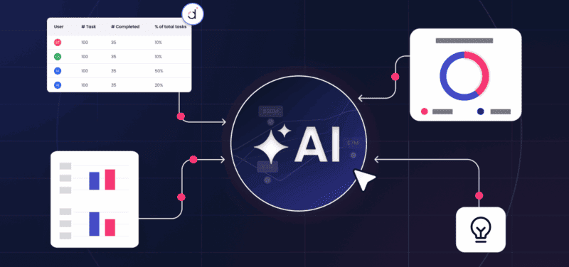
Click for Takeaways: Financial Dashboard Examples
- Good financial dashboard examples should answer one specific question for one specific user. They’re not chart dumps.
- This guide covers 12 dashboard types, including multi-entity consolidation and AI-generated variance narratives.
- Every example comes with named KPIs, formulas, a real visual, and a note on who uses it.
- Financial dashboard templates in Excel are still a fine place to start, but a live-connected FP&A dashboard updates itself as new actuals land, with no rebuild required.
- Datarails FinanceOS consolidates data from 600+ sources and pairs live dashboards with Datarails AI, so the numbers and the narrative behind them update together.
Most collections of financial dashboard examples show you a chart and move on. The chart is the easy part.
A good dashboard answers a specific question, for a specific person, at the level of detail they need for the decision in front of them. A board member checking cash runway before a funding conversation needs something different from a controller closing the books. While it’s often the same underlying data they’re after, they need different dashboards.
That question sits at the center of what is financial analytics: turning raw numbers into a decision someone can act on.
That’s how we organized this guide: By who’s looking at it and what they’re trying to decide, not just by chart type. Each example shows the KPIs, the formulas, a real visual, and a plain answer to “when should I build this.”
Teams searching for the best accounting dashboard for financial reporting are usually comparing financial dashboard software that already knows their chart of accounts, not a blank canvas.
Financial dashboards used to be static and backward-looking: a snapshot of what already happened, refreshed by hand once a month. Gartner’s data-analytics research describes the shift underway: dashboards moving from static charts to systems that embed recommendations and next steps directly into the workflow, which is exactly what the AI-generated variance narrative example near the end shows in practice.
“Fifty percent of North American CFOs say digital transformation of finance is their top priority for 2026.”
– Deloitte, 2024, Q4 2025 CFO Signals
12 Financial Dashboard Examples Every Finance Team Should Know
1. Executive/Financial KPI Dashboard
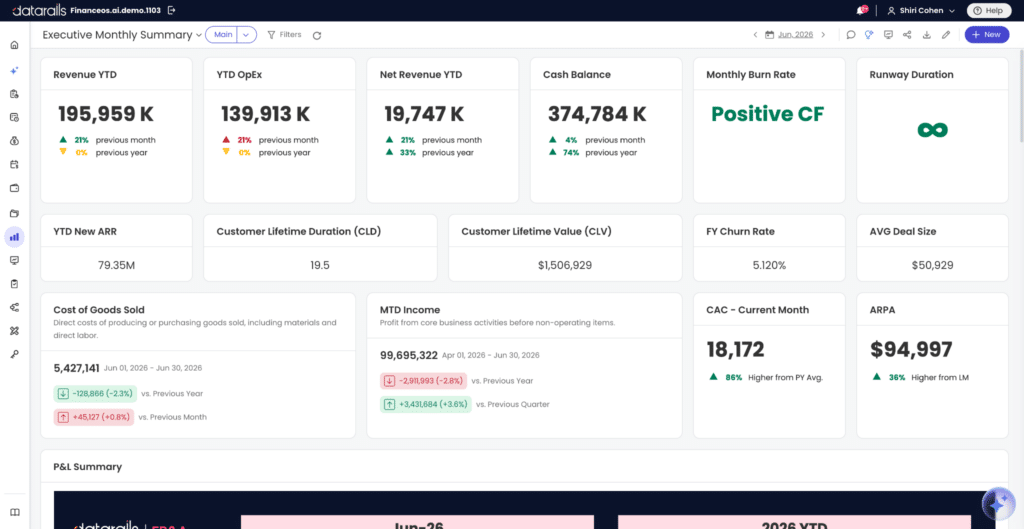
An executive financial dashboard gives a CEO, board member, or leadership team the five-second version of business health: no drill-down, no department detail, just the numbers that answer “are we on track.” This is also what people mean by CFO dashboard examples or FP&A dashboard examples, since the audience and intent overlap.
Core metrics: Revenue, net profit, cash balance, operating expenses, budget vs. actual, and at-a-glance ratios like gross margin.
Who uses it: CEOs, boards, and the CFO presenting to them.
Verdict: Build this first, since it’s the front door to every other dashboard on this list.
2. Cash Flow Dashboard Example
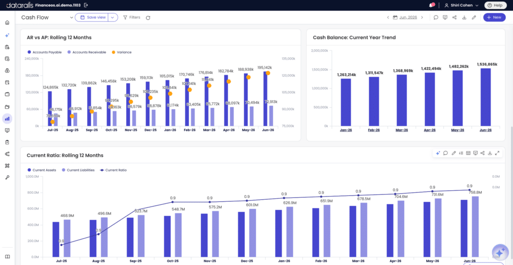
A cash flow dashboard displays real-time data to help you monitor your business’s cash flow and assess its financial health. A good cash flow dashboard includes these core metrics:
- Cash on hand: Usually monitored so that if it falls below target, the company can take contingency measures. A rule of thumb is to continuously check cash on hand against the target set during your financial projection. You can quickly tell if you have enough cash on hand to meet short-term needs by looking at your quick ratio and working capital ratio.
- Cash conversion cycle: By tracking this metric, a business can identify the source of its cash flow problems. A lower cash conversion cycle means more cash on hand to generate returns and less reliance on a line of credit. The formula: cash conversion cycle = days inventory outstanding + days receivable outstanding, minus days payable outstanding.
- Gross profit margin: The money made directly from selling goods and services, minus the cost of the sale. It excludes indirect costs like marketing, and it’s used to gauge the value of every sale and guide pricing and promotion decisions. Formula: gross profit margin = gross profit divided by revenue, times 100.
- Operating cash flow vs. free cash flow: Allows a team to see cash generated by operations separately from cash left after capital spending
- A waterfall-style inflow/outflow view: Shows the bridge from opening to closing cash more clearly than a single line
Who uses it: Treasury, controllers, and CFOs watching runway.
Verdict: Build this second, right after the executive view. Cash problems move faster than P&L problems, and this dashboard catches them early. See how data visualization extends this into full cash flow forecasting, and how Datarails Cash keeps it connected to your bank feeds.
3. Profit and Loss Dashboard (P&L dashboard)
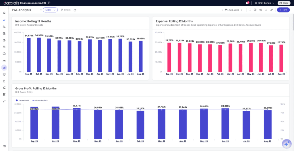
A P&L dashboard, also known as a financial reporting dashboard, summarizes expenses, revenues, and the costs incurred throughout a fiscal year. It is used to show the critical performance metrics that describe a business’s profitability and financial health. It helps management find ways to raise the bottom line while reducing unnecessary costs.
Use our free Profit and Loss Excel template to track company income and expenses all in one place.
Variance metrics work best in real time, with alerts and drill-down so a problem gets caught rather than discovered at close. Regular variance analysis, whether monthly or quarterly, helps CFOs spot patterns, uncover recurring trends, and reallocate resources effectively by adjusting budgets based on real-world performance.
Core metrics: Revenue by line, gross margin, operating expenses by category, EBITDA, and net margin, shown against budget and against the prior period.
A clear revenue-vs-cost-vs-expense breakdown, usually a stacked bar or a simple waterfall, does more work here than a table of numbers. It shows at a glance whether a margin problem is a revenue issue or a cost issue.
Who uses it: FP&A analysts, controllers, and department heads reviewing their piece of the P&L.
Verdict: Use our free profit and loss statement template as a starting structure, then track variance monthly so the “what changed” question has an answer built in, not just the “what happened” one.
4. Balance Sheet Dashboard
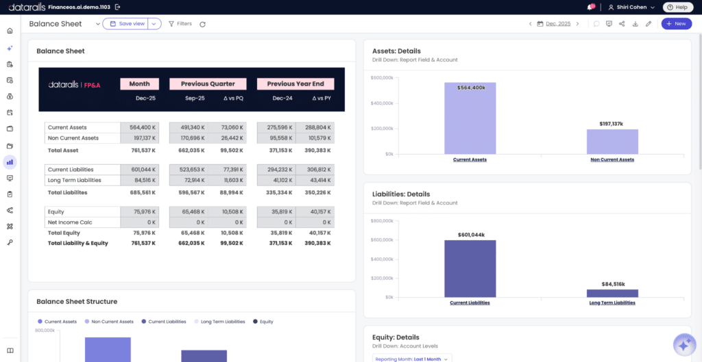
A balance sheet dashboard allows users to review and analyze data from their balance sheets and gain a quick understanding of the business’s financial condition and, as they close the books each month, diagnose any abnormalities in the data.
A balance sheet dashboard usually contains 9 KPIs, and they are:
- Current assets: The assets expected to be turned into cash in less than a year, which include accounts receivables, cash, and inventory
- Current liabilities: The bills that must be paid within one year of the balance sheet date, which include accounts payable, accrued expenses, and income taxes payable
- Working capital: The amount the business has to work with in the short term. Current assets minus current liabilities
- Working capital ratio: Current assets divided by current liabilities
- Quick ratio: Current assets minus inventory, divided by current liabilities. A tighter test of short-term liquidity than the working capital ratio, since it strips out stock that may not convert to cash quickly
- Total assets: These are the final amount of all gross investments, receivables, and other assets presented on the balance sheet
- Total liabilities: The sum of current liabilities and long-term debt
- Total equity: Total assets minus total liabilities
- Debt to equity ratio: Total liabilities divided by total equity
Who uses it: Controllers during month-end close, and CFOs assessing solvency before a financing conversation.
Verdict: Start from our free balance sheet template to get insights into reported actuals and adjust the scenario selection for each month to evaluate performance against the plan.
5. Budget vs. Actual Dashboard
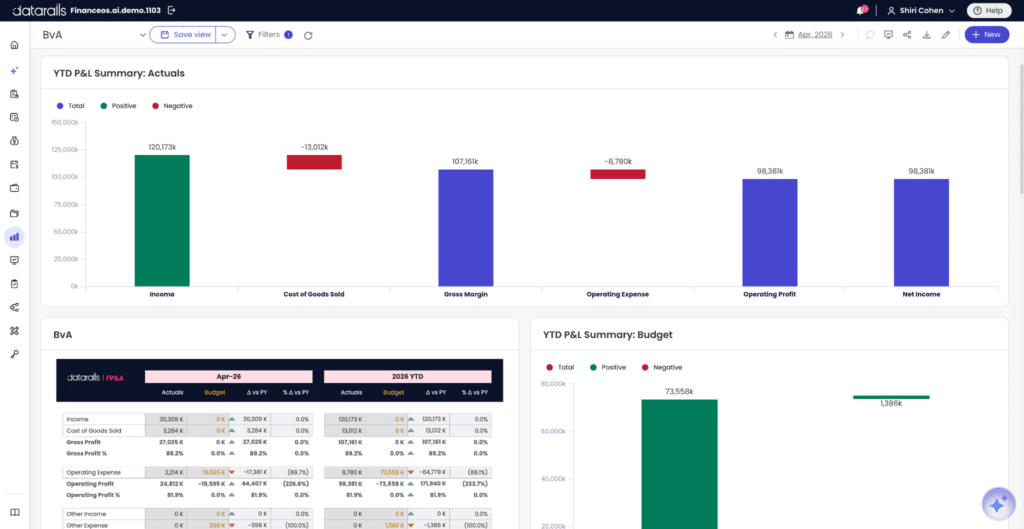
A budget vs. actual dashboard lines up planned spend against real spend, by department, with variance called out in plain terms.
Core metrics: Planned budget, actual spend, variance in dollars and percent, and a color-coded threshold (green under 5%, yellow 5-10%, red over 10%).
Who uses it: FP&A managers running the monthly close-out review, and department heads accountable for their own numbers.
Verdict: Build it with drill-down to the account level, or the color-coding alone won’t explain why a variance happened. Our budget variance analysis guide covers how to set thresholds that mean something.
6. Financial Performance/Ratio Dashboard
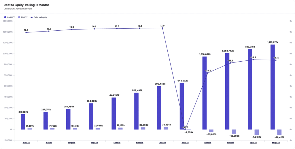
A financial performance dashboard tracks the ratios that show how efficiently a business turns assets and equity into profit.
The four metrics used in this dashboard are:
- Return on Assets (ROA)
- Working Capital Ratio (WCR), via our working capital template
- Return on Equity (ROE)
- Debt-Equity Ratio (DER)
Together they show whether the business is earning an adequate return on what it has invested, and how much of that return is financed by debt.
Who uses it: CFOs and investors evaluating operating efficiency, not just revenue growth.
Verdict: Keep this one small on purpose. Four ratios, tracked over time, tell a clearer story than twenty metrics competing for attention.
7. Expense Detail Analysis Dashboard
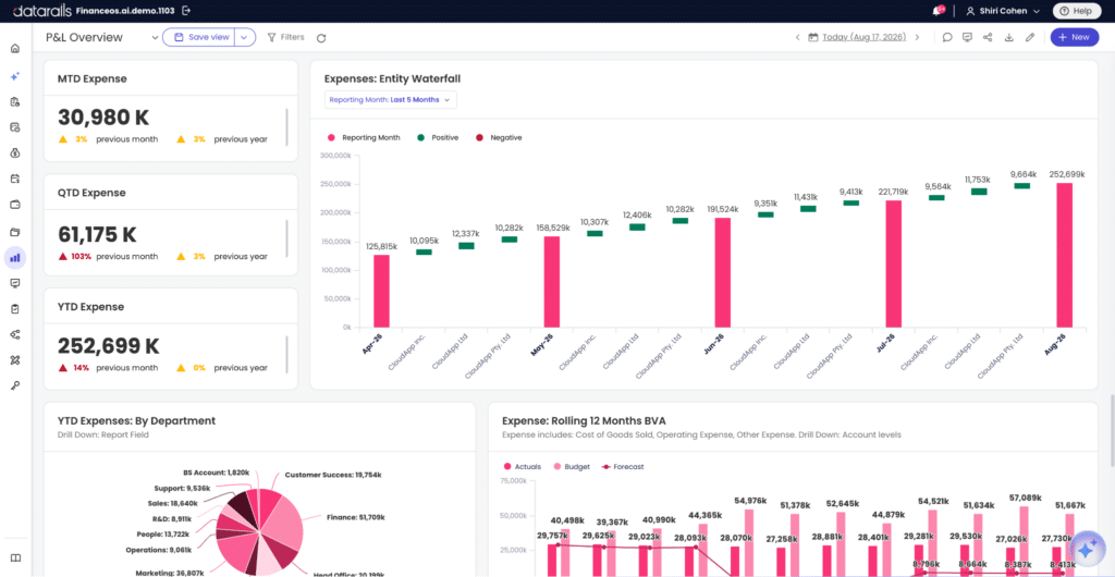
This dashboard lets you record monthly target and actual expenses and compare them to see target realization percentages. It also lets you explore the relationships between values in the data model, such as expense types, products, and departments.
Core metrics: Target expense vs. actual by category, spend by department, and month-over-month trend by cost center.
Who uses it: Department managers who own a budget line, and the FP&A analyst consolidating those lines into the company-wide view.
Verdict: This pairs naturally with the budget vs. actual dashboard above. Together they answer “did we overspend” and “on what, specifically.”
8. Accounts Receivable Dashboard
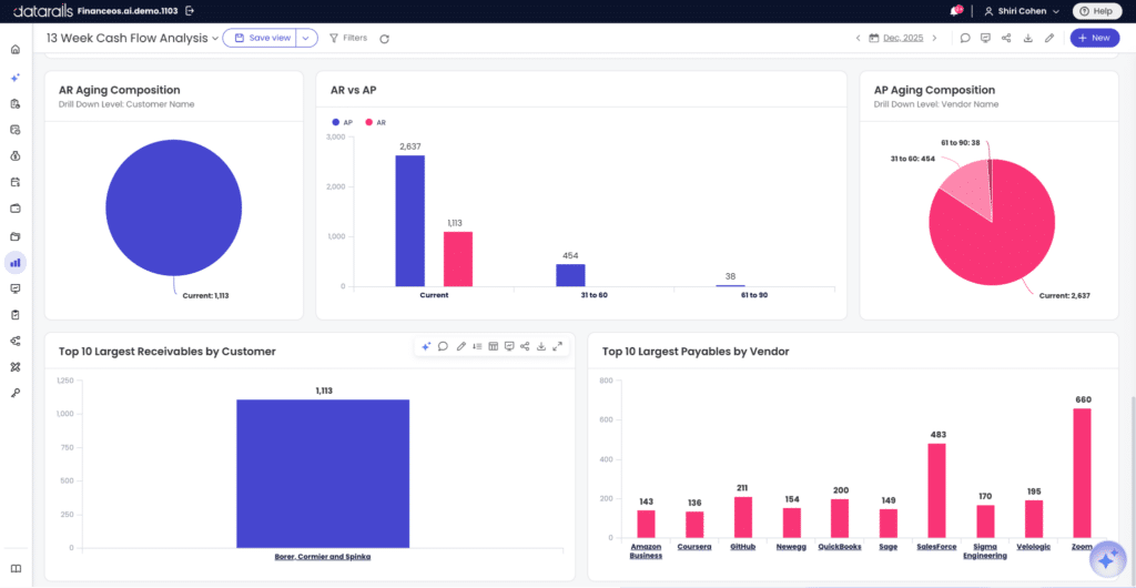
An accounts receivable dashboard is a direct line into cash flow health, since money sitting in unpaid invoices is money the business can’t use yet.
Core metrics: Outstanding invoices by age bucket (0-30, 31-60, 61-90, 90+ days), collection rate, and Days Sales Outstanding, calculated as accounts receivable divided by total credit sales, times days in the period.
Who uses it: Controllers and AR teams, plus the CFO watching how DSO trends against the cash flow forecast.
Verdict: Build this if collections are slow or unpredictable. A rising DSO is usually the earliest warning sign of a cash crunch.
9. SaaS Financial Dashboard (Recurring Revenue)
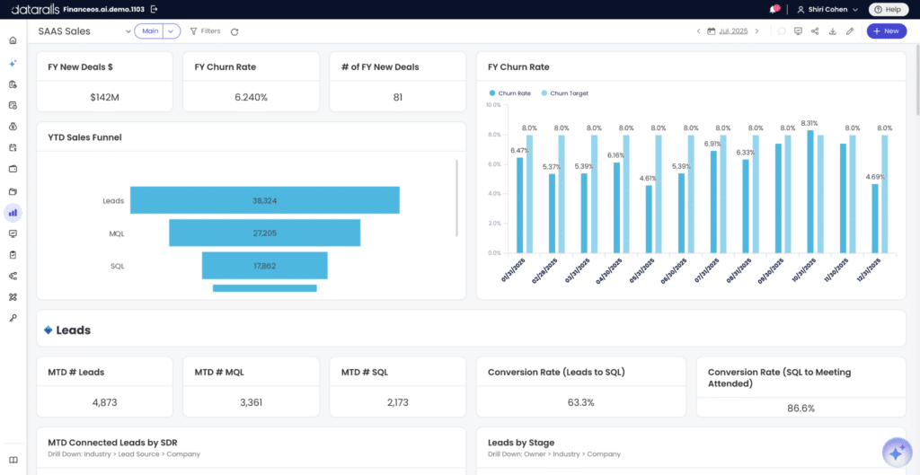
A SaaS financial dashboard tracks the metrics that matter to a subscription business, which don’t map cleanly onto a traditional P&L.
Core metrics: Monthly Recurring Revenue (MRR), Annual Recurring Revenue (ARR), Customer Acquisition Cost (CAC), Lifetime Value (LTV), churn rate, and Net Revenue Retention (NRR).
Who uses it: FP&A teams and CFOs at subscription businesses, where growth quality matters as much as growth rate.
Verdict: Build this alongside, not instead of, your P&L dashboard. Investors and boards will ask for both.
10. Forecasting/Scenario Dashboard
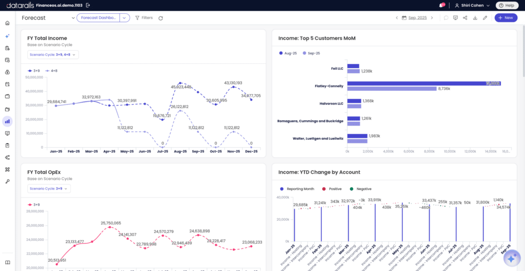
A forecasting dashboard shows how the plan is trending against a rolling forecast, and lets a team compare scenarios side by side before committing to one.
Core metrics: Rolling forecast vs. original plan, best/base/worst-case scenario comparisons, and driver-based projections tied to their assumptions (headcount, pricing, churn).
Who uses it: FP&A leaders building the next board deck, and CFOs stress-testing a plan before it goes external.
Verdict: This only works if the underlying assumptions are visible and adjustable, not buried in a static chart. Our budgeting & forecasting resources cover how to structure driver-based models.
11. Multi-Entity Consolidated Dashboard
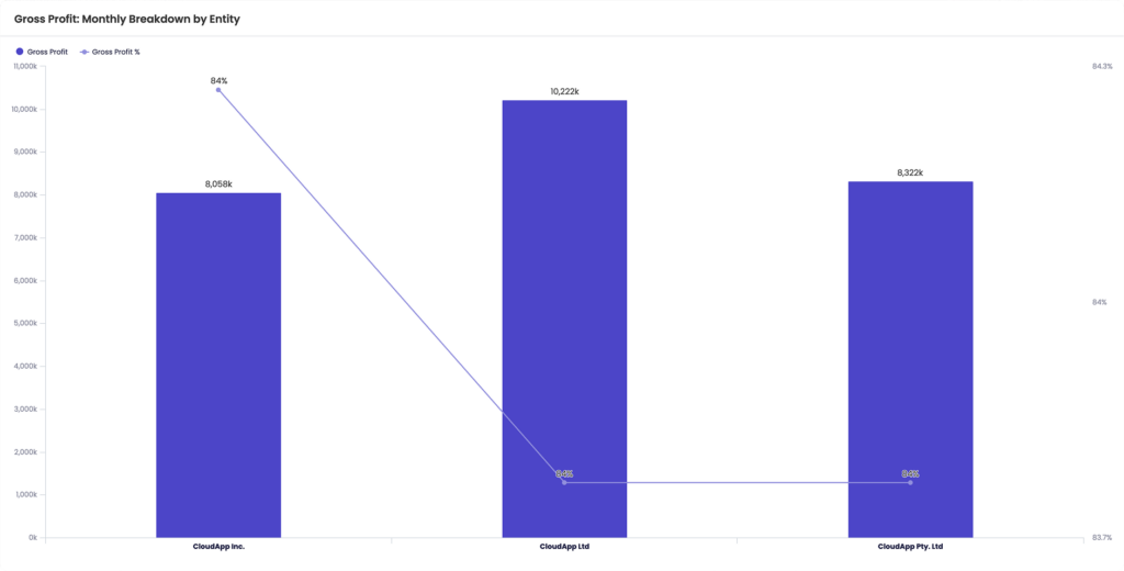
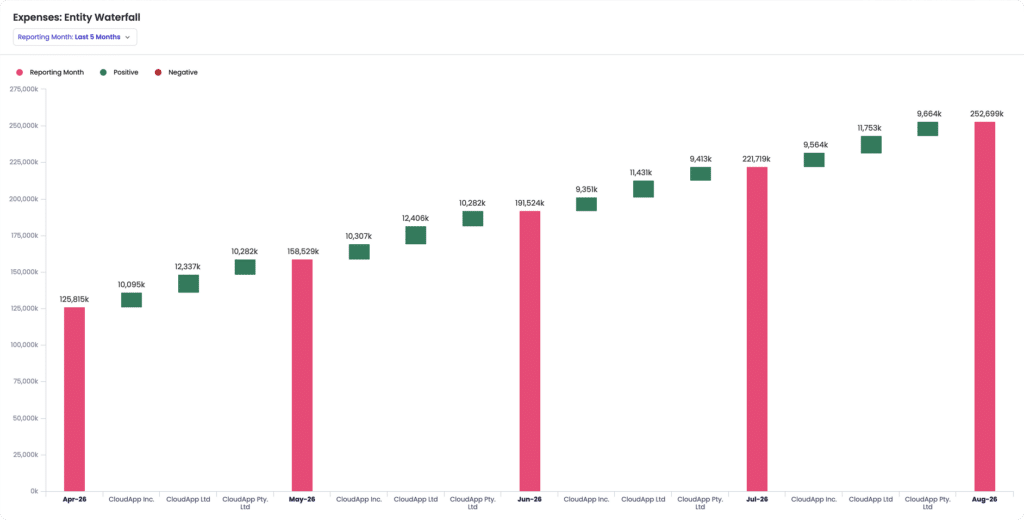
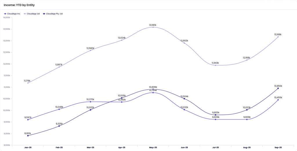
A multi-entity consolidated dashboard rolls up P&L or cash position across subsidiaries into one view, with account mapping that holds together even when each entity’s chart of accounts looks different.
In Datarails, multi-entity consolidation is built into the product rather than sold as an add-on.
Core metrics: Consolidated revenue and margin by entity, intercompany eliminations, currency-adjusted totals, and entity-level drill-down from the consolidated number.
Who uses it: Finance teams managing data consolidation across multiple subsidiaries, and CFOs who need one number for the board plus the ability to explain which entity drove it.
Verdict: Build this the moment you have more than one entity reporting into the same P&L. Doing it by hand, with separate workbooks stitched together each month, is exactly what consolidated financial statements platforms are built to remove.
12. AI-Generated Variance Narrative Dashboard
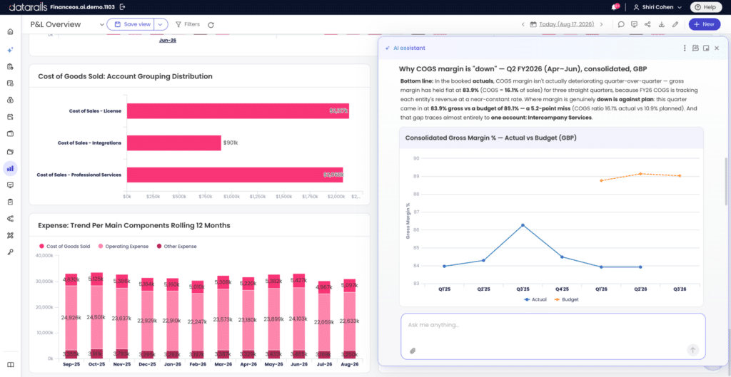
This is the clearest sign of where financial dashboards are heading. Instead of showing a chart and leaving the reader to interpret it, this dashboard pairs the visual with a written explanation.
How it works: A user asks a plain-language question, such as “why is COGS margin down 3 points this quarter,” and Datarails AI returns an account-level, board-ready explanation next to the chart, naming the driver, quantifying it, and pointing to the accounts behind it.
Core metrics: Whatever sits behind the question asked, pulled live from the connected data rather than a static commentary box.
Who uses it: FP&A analysts who’d otherwise spend hours writing board commentary by hand, and CFOs who want the “why” delivered with the “what.”
Verdict: This is the dashboard type to watch, and a preview of where AI in FP&A is headed across the rest of the reporting stack.
“56% of finance leaders now use AI tools in their daily work, double the 2023 rate, but only 17% are using AI in core finance workflows.”
– CFO Connect, State of AI in Finance 2026
Choosing the Right KPIs and Chart Types for a Financial Dashboard
Picking the right chart type matters more than most finance teams realize. The wrong chart hides the story sitting in the data.
- Line charts: Trends over time (revenue growth, cash balance, MRR)
- Bar or stacked bar charts: Comparisons and composition (budget vs. actual by department, revenue by product line)
- Waterfall charts: Cash flow bridges and anything that moves from a starting number to an ending number through a series of additions and subtractions
- Pie or donut charts: Use sparingly, and only with a small number of categories. Past four or five slices, a pie chart stops communicating anything a bar chart wouldn’t show more clearly
A short rule holds up across most examples above: time, use a line; comparison, use a bar; bridge from A to B, use a waterfall.
| Chart type | Best for | Example use |
|---|---|---|
| Line charts | Trends over time | Revenue growth, cash balance, MRR |
| Bar/stacked bar charts | Comparisons and composition | Budget vs. actual by department, revenue by product line |
| Waterfall charts | Bridges from a starting number to an ending number | Cash flow bridges, cash inflow/outflow |
| Pie/donut charts | Use sparingly, only with 4-5 categories max | Small category breakdowns only |
Financial Dashboard Design Best Practices
A well-chosen chart type still won’t save a dashboard that’s cluttered, inconsistent, or built without a clear question in mind. A handful of habits separate the dashboards people use from the ones built once and ignored.
- Show trends, not just static numbers. “Revenue: $2.1M” means little without last month or last year next to it.
- Limit the number of metrics per view. Five to eight KPIs per dashboard is a reasonable ceiling, since past that, nothing stands out.
- Highlight anomalies with color and contrast, so a number that needs a second look gets one before the reader even reads the label.
- Keep formatting consistent. Currency, percentage, and date formats should never shift from one panel to the next.
- Build in drill-down. Every summary metric should let a user reach the account-level or transaction-level detail behind it.
- Design for the decision, not the data. Every chart should answer a specific question a stakeholder is asking, or it probably doesn’t belong on the dashboard.
Companies that give teams live visibility into performance data see measurable gains in decision speed and confidence, including a 14% revenue lift tied to better use of customer and performance analytics.” (Forrester)
How to Build a Financial Dashboard: Two Paths
There are two reasonable ways to build a financial dashboard today, and which one fits depends mostly on how many data sources you’re pulling from and how often the numbers change.
Path 1: On an FP&A Platform (Recommended for Live, Multi-Source Data)
Connect your data sources once, apply your chart of accounts and KPI mapping, then drag the widgets you need onto the canvas. From there, the dashboard refreshes automatically as new actuals land, no rebuilding a pivot table every month.
This is the path that scales, and the only practical way to build the multi-entity consolidated view and the AI-generated variance narrative, since both depend on data staying live rather than pasted in once and left to go stale.
Path 2: Financial Dashboard in Excel, Built Manually
For teams without a platform yet, Excel is still a workable starting point, just a higher-maintenance one.
- Consolidate all your data on an Excel spreadsheet.
- Create a pivot table, selecting your range and tabs.
- Create a chart, bar chart, line chart, pie chart, or combo chart, and rename the series to match what they represent.
- Insert slicers: On the pivot table, click PivotTable Analyze, insert slicer, and choose the fields you need.
- Copy the categories you want and paste them into the slicer section of the dashboard sheet.
- Create as many pivot tables and charts as required, and format them for the different statements you’re tracking.
- Once the slicers are in place, arrange the charts and slicers together so the complete dashboard sits on one tab.
This works fine for a single entity with a handful of data sources. It gets noticeably harder past that point, since every new source means another manual import, and every new month means checking that last month’s pivot table didn’t break.
| Category | Building in Excel | Building on an FP&A Platform |
|---|---|---|
| Setup time | A few hours per dashboard, redone monthly | A few hours once, self-updating after |
| Live ERP connection | No, manual export and import | Yes, connects directly to your financial dashboard software‘s data sources |
| Multi-entity consolidation | Manual, workbook by workbook | Built in, with automatic account mapping |
| Refresh cadence | As often as someone remembers to rebuild it | Real-time or on a set schedule |
| AI-generated narrative | Not available | Available, via the Datarails AI Reporting Agent |
“Cloud-based planning, budgeting, and forecasting is the top technology investment for CFOs in 2026, cited by 43% of finance leaders.” (Deloitte, Q1 2026 CFO Signals)
Financial Dashboard Templates to Start From
If you’re building the manual path, don’t start from a blank sheet. Our free profit and loss and balance sheet templates linked above give you the KPI structure already laid out.
The working capital template covers the working capital ratio and liquidity metrics used in the balance sheet and ratio dashboards. They work as a standalone Excel build, and as a bridge if you move to a platform later, since the KPI structure carries over either way.
How Datarails Turns Financial Dashboard Examples Into Live, AI-Ready Reporting
Everything above works as a one-time build. The harder problem is keeping it current every month without redoing the work by hand, which is the gap Datarails is built to close.
Datarails connects to 600+ ERPs and data sources, from NetSuite and SAP to QuickBooks, Sage, and Salesforce, through its integrations, so the dashboards above pull live actuals instead of a monthly export. That covers multi-entity consolidation directly: account mapping stays consistent across entities, and a consolidated P&L or cash position updates as each subsidiary’s numbers come in.
Datarails AI adds three agents on top of that live data:
- The Reporting Agent: Surfaces the drivers behind a variance and writes the explanation, the engine behind the AI-generated variance narrative dashboard above.
- The Planning Agent: Supports fast scenario analysis and rolling forecasts, feeding the forecasting dashboard directly.
- The Strategy Agent: Works at a higher level, turning data into options and trade-offs. Insights and Storyboards then package it into board-ready summaries in a couple of clicks.
None of that requires leaving Excel. Teams can build and view dashboards inside Excel, in Datarails’ web-based data visualization environment, or export straight to PowerPoint, with the underlying financial reporting staying connected either way. It’s a big part of why Datarails ranks among the best FP&A software and financial reporting software picks for teams that want to stay in Excel.
For multi-entity teams, Datarails Cash extends this into live cash positioning across the group, and the broader FP&A software platform ties planning, reporting, and consolidation into one system instead of three separate tools passing files back and forth. Teams in Datarails for financial services use the same approach for multi-fund structures.
See how Datarails turns your financial dashboards into live, AI-ready reporting, connected to every ERP, refreshed automatically, and still inside Excel.
Final Thoughts
The best financial dashboard examples share a common thread: they’re built around a question someone needs answered, not whatever data was easiest to pull. Start with the executive and cash flow views, add the dashboards that match your business model, and hold every chart to the same standard: one clear question, one clear answer, one clear next step.
Whether you build the first version in Excel or on a platform, the templates above will get you most of the way there. You’ll notice the difference in month two, when the Excel version needs rebuilding and the platform version just refreshes.
Financial Dashboard FAQs
The main types include:
– Executive dashboards
– Cash flow dashboards
– P&L dashboards
– Balance sheet dashboards
– Budget vs. actual dashboards
– Ratio dashboards
– Expense dashboards
– Accounts receivable dashboards
– SaaS dashboards
– Forecasting dashboards
– Multi-entity consolidated dashboards
– AI-generated narrative dashboards
Most teams don’t need all twelve at once. Pick two or three to start that match the decisions your team makes most often.
A general-purpose financial KPI dashboard usually includes revenue, net profit margin, cash balance, operating expenses, budget vs. actual variance, and a liquidity ratio like the working capital ratio.
Beyond that, the right KPIs depend on the dashboard type: a SaaS dashboard needs MRR and churn, a cash flow dashboard needs the cash conversion cycle.
A CFO dashboard is built for a high-level, decision-focused audience: a small number of KPIs, minimal detail, readable in under a minute. An FP&A dashboard is built for the analysts and managers doing the underlying work, so it carries more detail and more of the department-level breakdowns that feed the CFO-level summary.
Yes. Consolidate your data on a spreadsheet, build a pivot table, create a chart from it, and add slicers so the view can be filtered. This works well for a single entity with a small number of data sources, and gets harder once you’re pulling from multiple systems, which is usually when teams move to an FP&A dashboard platform instead.
Good design makes trends stand out rather than isolated numbers. Other common traits include limiting each view to five to eight KPIs, using color and contrast to flag anomalies, keeping formatting consistent, and letting a user drill down from any summary metric to the detail behind it.